A redesign of iOS Chase Bank app using human-computer-interaction(HCI) methods and principles.
Github Repo is private. Please contact me for if you are interested in a demo.
 Image Source
Human-computer interaction has been an widely-studied field since the birth of graphical user interface (GUI): Xerox PARC
I have been a Chase iOS app user for years. It is a powerful app but the interface seems unnecessarily overcrowded. The account tab puts too many features and the features vialate some of the HCI design principles including consistency, simplicity, afforfance,
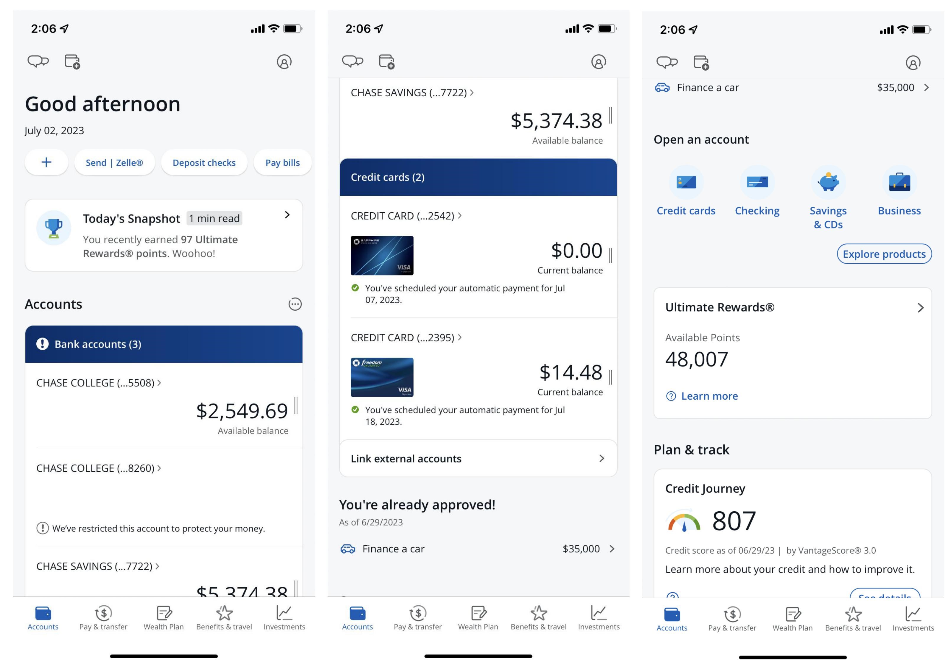
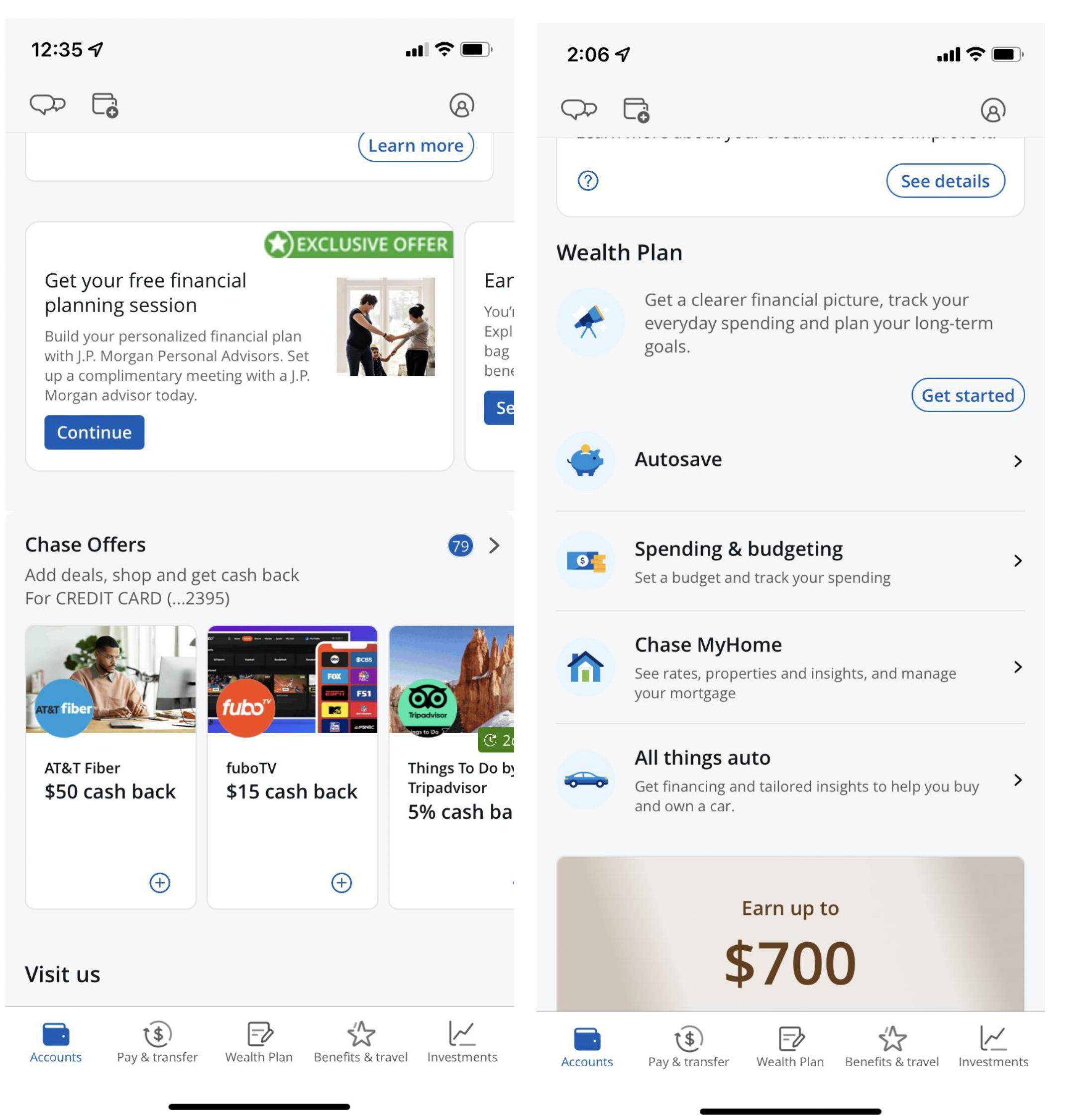
The projects focuses on redesigning the interface of the Chase Bank app on the iOS platform. The current interface of the app suffers from overcrowding, making it challenging for users to locate desired features and information efficiently. The project employs both interactive and passive need-finding methods to identify user needs and areas for improvement.

 The current interface of Chase iOS app
In the interactive need-finding method, post-event sessions are conducted with current Chase Bank app users through Teams meeting. Participants perform typical tasks related to managing their financial accounts while providing feedback on their experiences, difficulties, and suggestions for improvement. The researcher also utilizes the passive need-finding method by analyzing user reviews of the app on the iOS app store.
The need-finding sessions reveal several weaknesses in the interface, including redundant display of account balance information, difficulties in understanding transaction purposes, and inadequate interface design for monitoring monthly spending. The product reviews highlight concerns regarding customer service accessibility, lack of a global search feature, and challenges in recognizing transaction statuses.
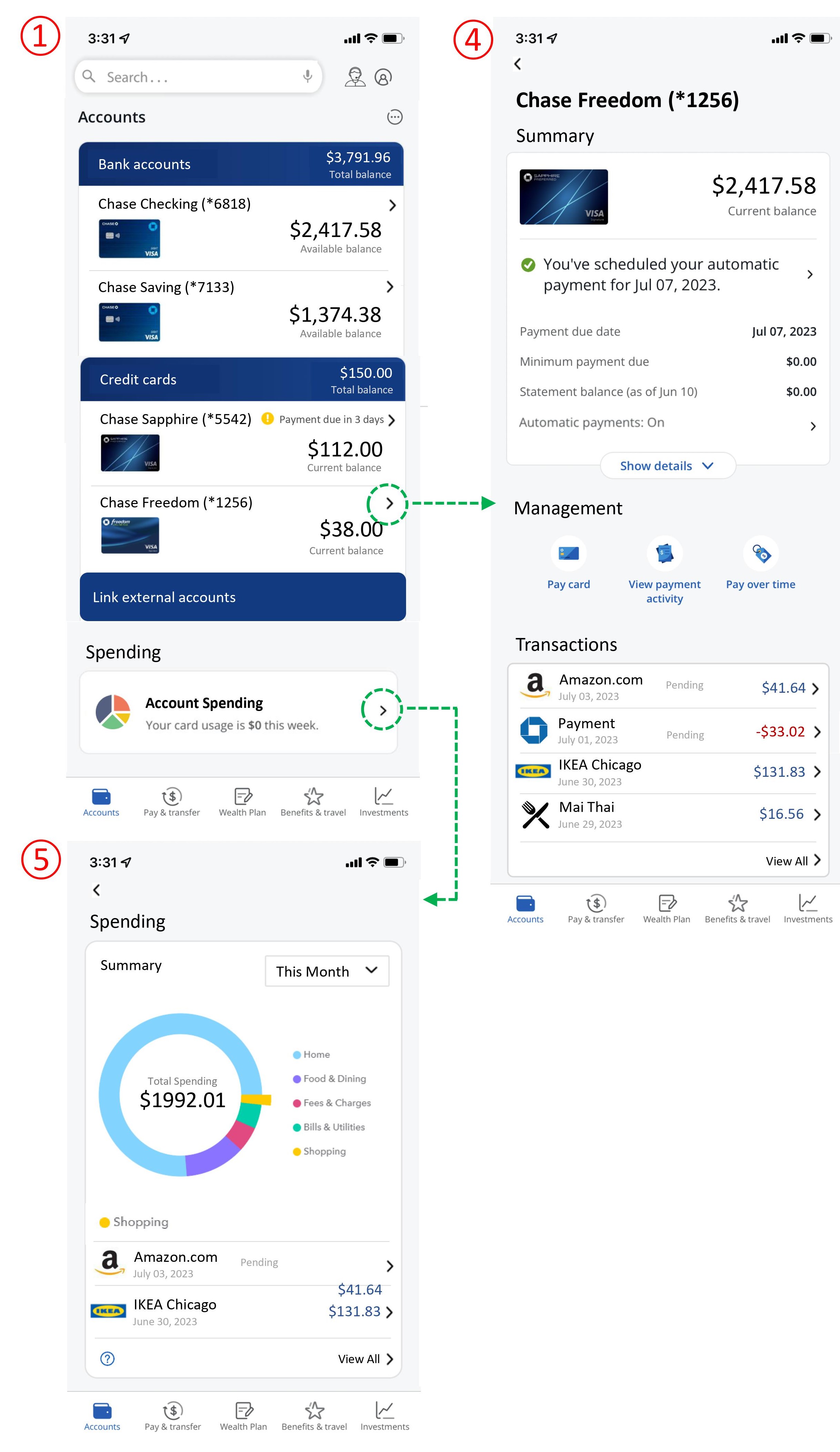
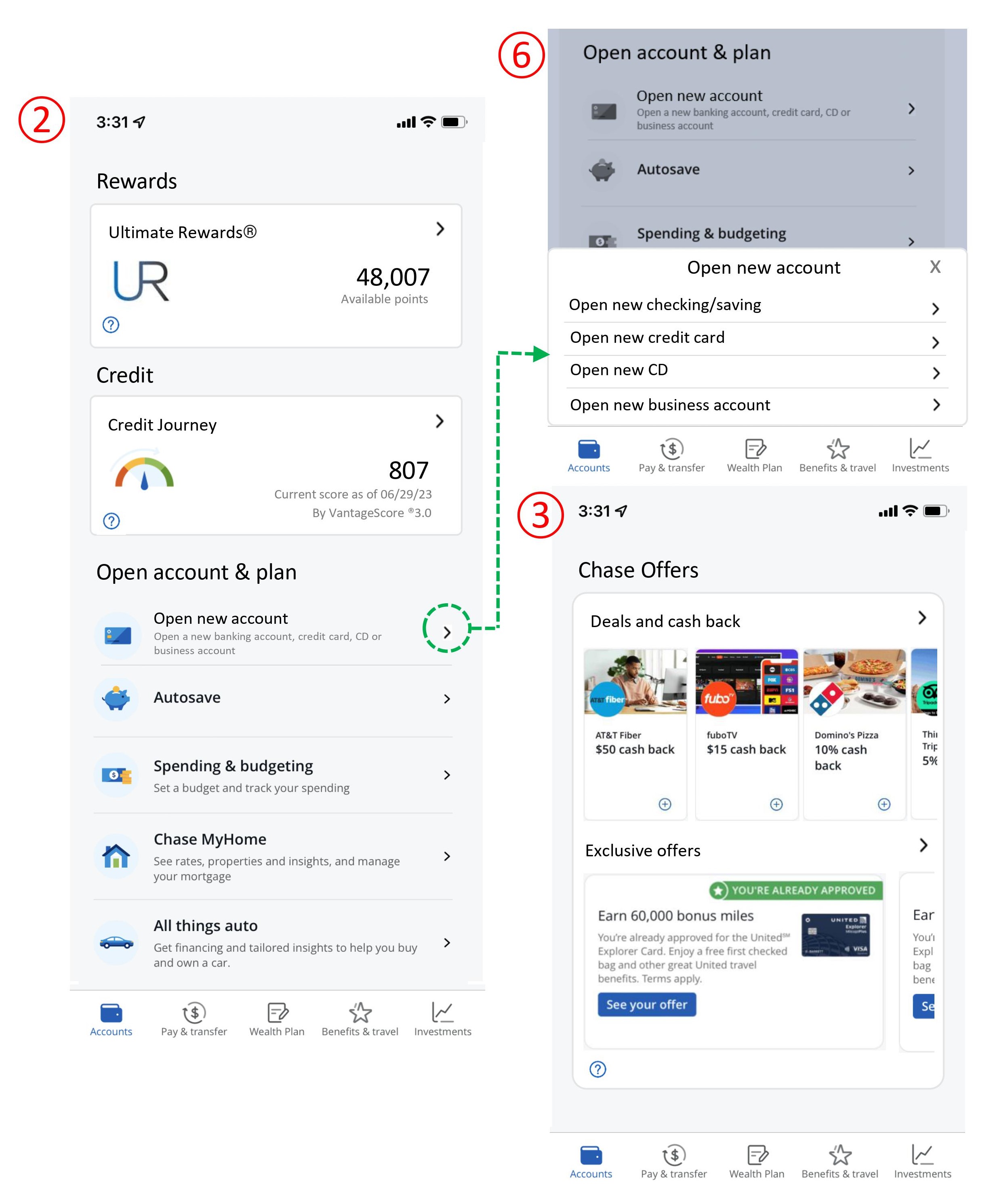
Based on the identified needs and weaknesses, an interface redesign using wireframe prototypes is created (see below). The redesign addresses the weaknesses by improving structure, simplicity, discoverability, and perceptibility. It consolidates related elements, removes irrelevant information, enhances the representation of spending data, and simplifies access to customer support.

 The new design of Chase iOS app interface
Finally, an evaluation plan using an empirical method to compare user preferences between the original and redesigned interfaces is conducted. The plan involves participant recruitment, control and experimental conditions, identification of independent and dependent variables, hypotheses, experimental design, and statistical tests to determine the effectiveness of each interface. In the end, based on the statistical results of the user evaluation, it is believed that the redesign is more favourable to user.
Overall, the project provides a comprehensive overview of the existing interface, user needs, interface weaknesses, redesign solutions, and evaluation approach, showcasing a systematic approach to improving the user experience of the Chase Bank app on iOS.